
How I Designed a Walkthrough, Simplified the User Journey, and Increased Clarity
As a UX designer at Founderway, I recently encountered a common user experience issue: users getting lost in the app. This frustration became evident through user feedback, highlighting the need for a solution. Founderway offers a powerful platform, but without a built-in guide, users are unsure how to navigate its features.
Timeline
1 Weeks
Team
Individual
Tools
Figma, Canva, FigJam, Photoshop
Methods
Competitive Analysis, Information Architecture, User Interviews, User flow, User Testing, Lo-fi, High-fi, Hand off document
User feedback painted a clear picture: a lack of in-app guidance left them feeling lost. They struggled to find key features and understand how to use them effectively. This frustration hindered their ability to get started and contribute to Founderway's mission.
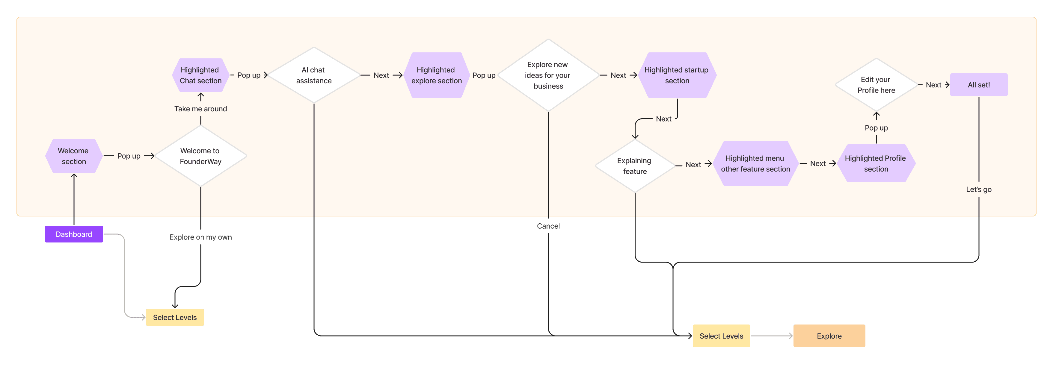
To address this, I decided to create a user-friendly walkthrough. This in-app guide would provide step-by-step instructions, highlighting key functionalities and guiding users through the platform.
How I designed, refined, and brought the walkthrough to life
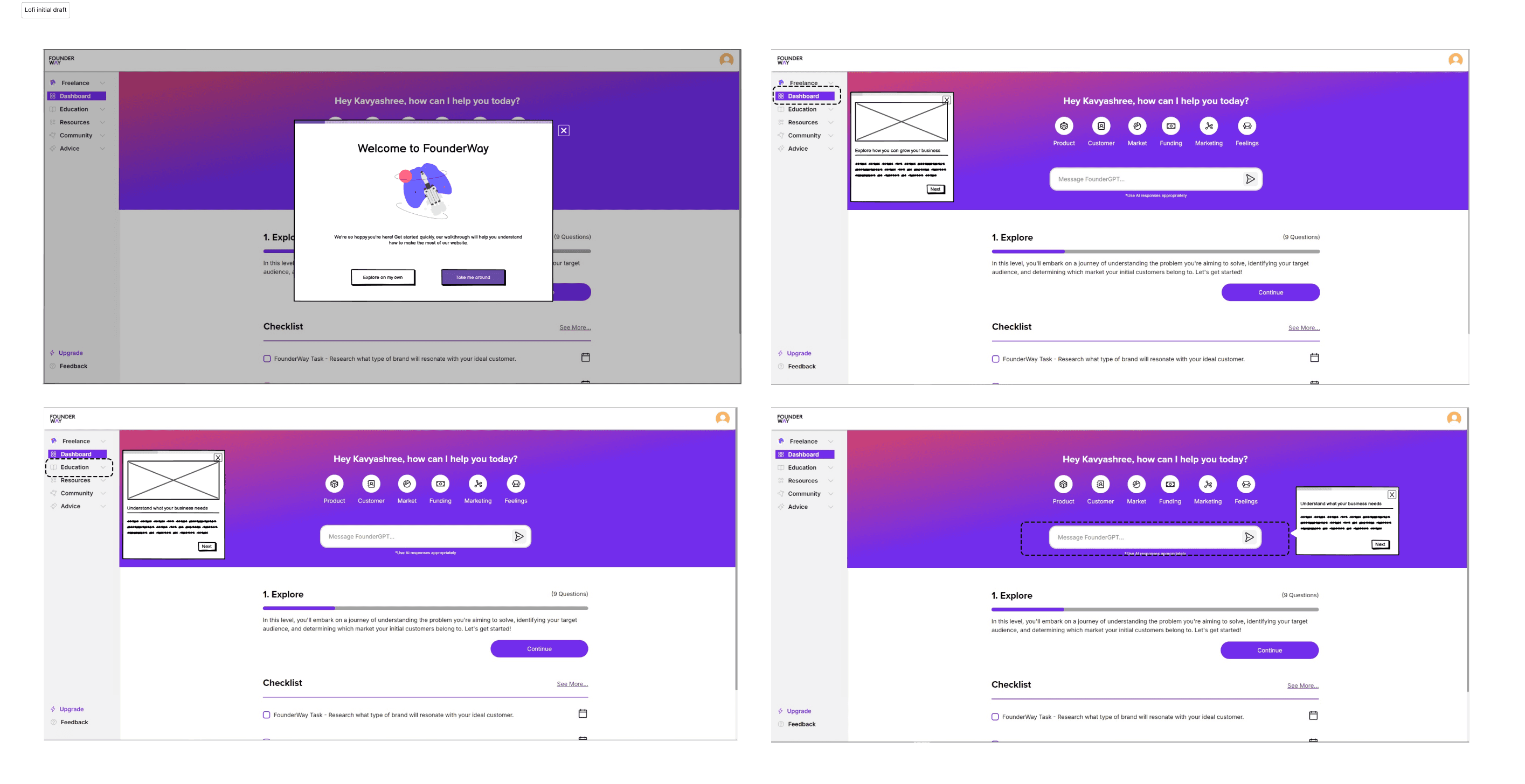
These initial sketches focused on core functionalities and user flow. They were essentially rough maps, ensuring the walkthrough wouldn't be a confusing detour, but a clear path forward.
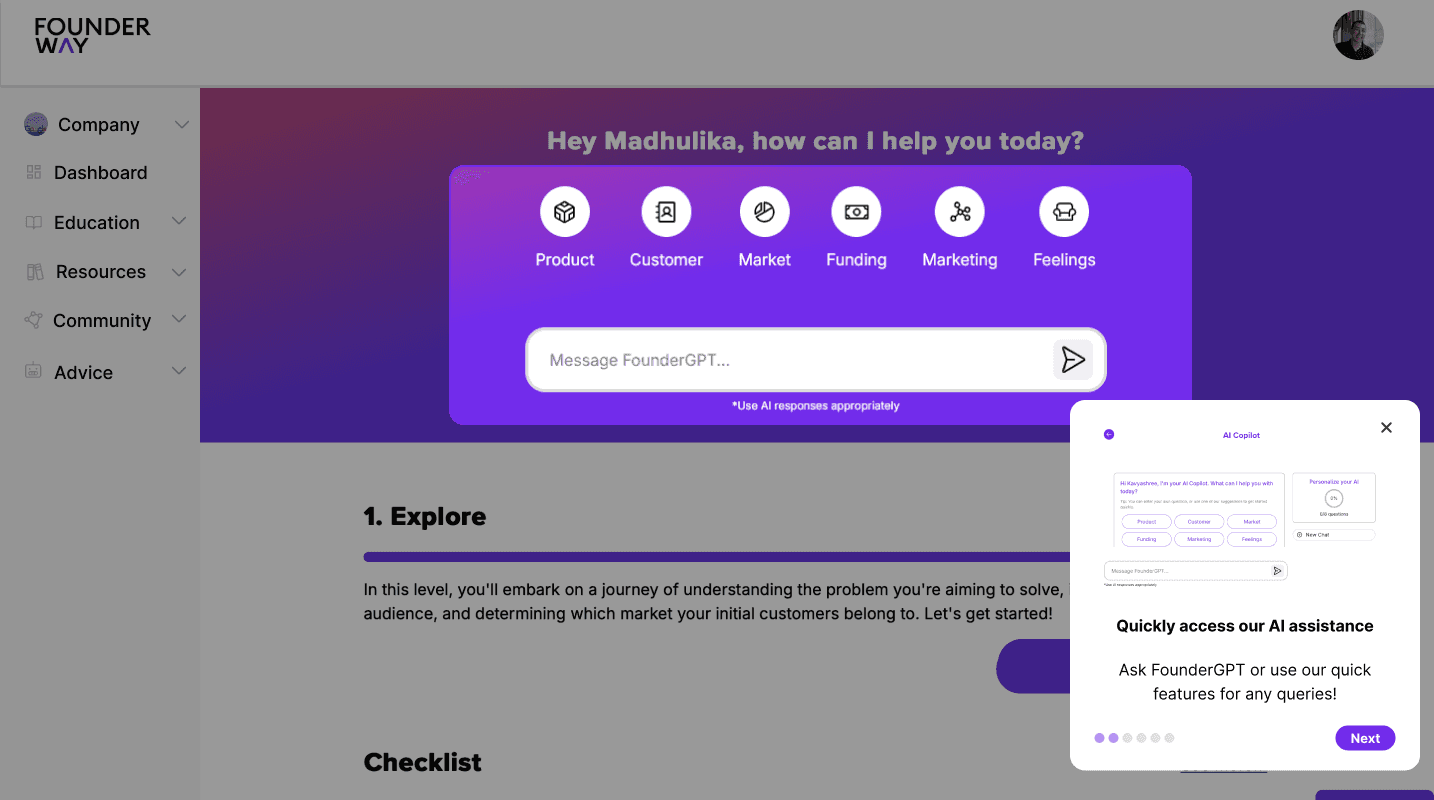
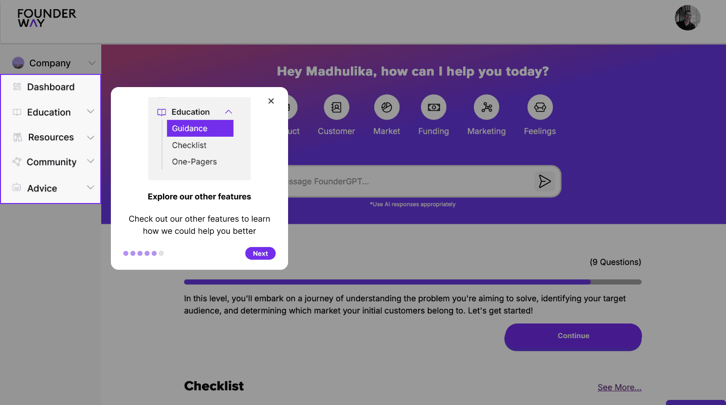
Added visual elements, enhanced clarity, and refined the design
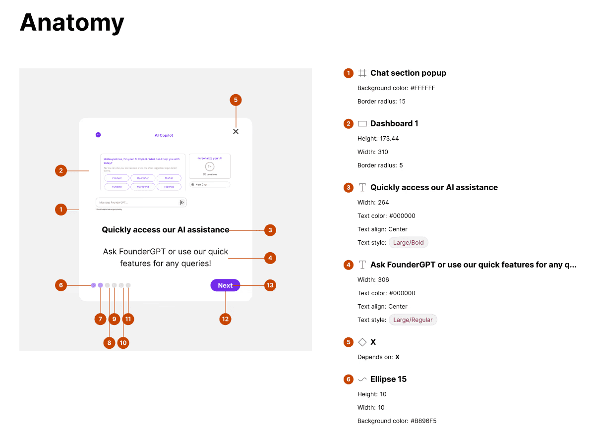
The final stage brought the walkthrough to life with Founderway's branding and visual style. This high-fidelity prototype provided a realistic glimpse of the user experience.

With a meticulously documented design in hand, I ensured a smooth transition by handing off the walkthrough specifications to the development team. Now, the wait begins! We're all eager for the launch, confident that this walkthrough will empower users to navigate Founderway with confidence and unlock its full potential.


Stay tuned – I'll be monitoring user data and feature adoption once deployed. This case study will be updated with the results, offering valuable insights into user behavior within the Founderway platform