
Rapid Redesign: Solving Dashboard Usability Issues in a 72-Hour Interview Challenge
3 days, 1 goal: During an interview, I was challenged to optimize a dashboard of my choice within a 3 day timeline. Leveraging my experience as a former advisor, I selected the MentorMe platform, a dashboard application, aiming to enhance its ability to facilitate targeted support and improve student outcomes.
This case study demonstrates my focus on streamlining data presentation and enhancing usability within tight deadlines.
Team
Individual
Methods
Surveys, Interviews, Usability Report, User Interviews
Tools
Figma, Balsamiq, Google Forms, MS Suite, Zoom, Quadratics
3-Day Breakdown
Day 1: Research & Understanding the Problem
Day 2: Ideation & Low-Fi Prototyping
Day 3: High-Fi Prototyping & Presentation Prep
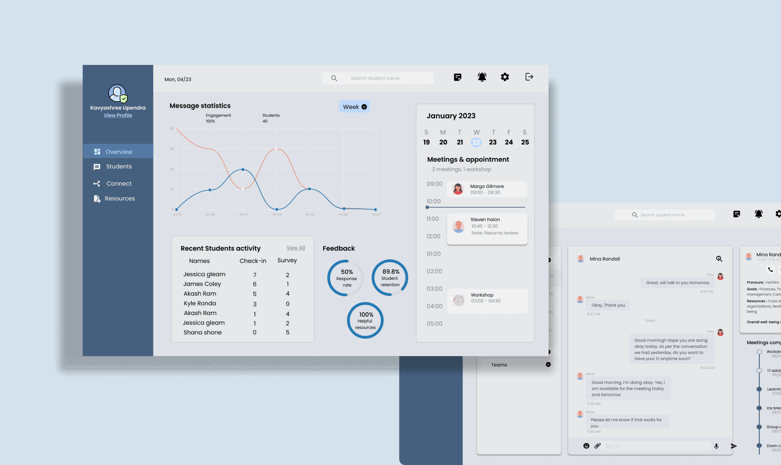
A glimpse into the dashboard functionalities


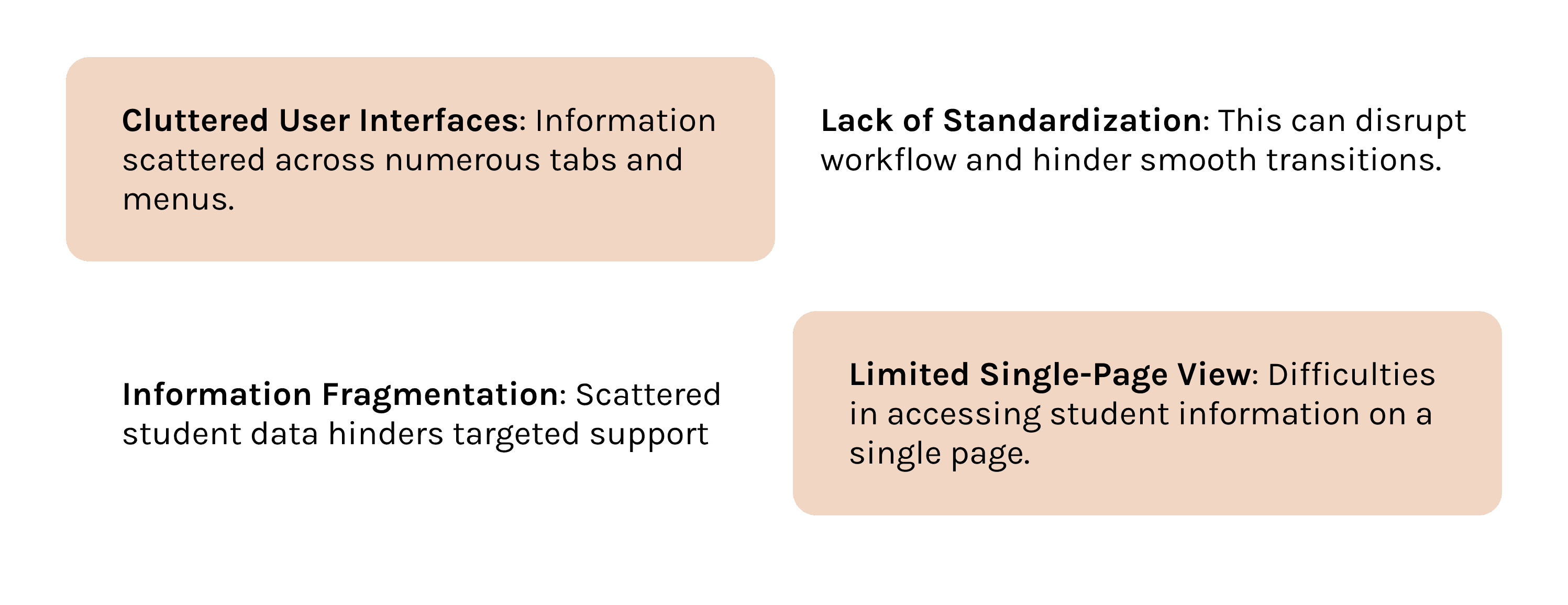
Mentoring dashboards often overwhelm mentors with too much information and clunky interfaces, hindering their ability to quickly understand student needs and make informed decisions.
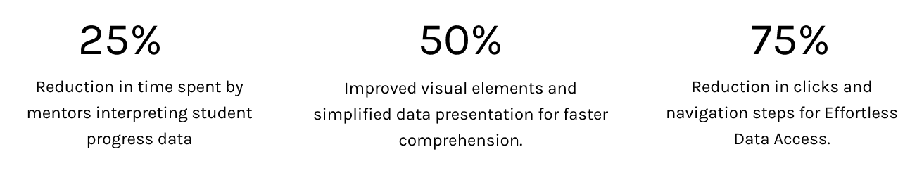
Quantifying Mentor Frustrations: Difficulty tracking progress & Information
I conducted mentor research and found two key issues: difficulty comparing student progress to goals and wasted time locating communication (messages, meeting notes).
The survey insights:
- 75% waste time searching for student data
- 30% struggle to identify struggling students proactively
- 65% have difficulty finding relevant resources
- 25% struggle to track student attendance consistently
User Journey Map: Identifying opportunities for improvements
Missed Opportunities for Action: Mentors lacked a clear, consolidated view of student needs, hindering timely support.
Communication Roadblocks: Finding past interactions and initiating contact with students was needlessly complex.
Resources Out of Reach: The dashboard failed to connect student needs with readily available support materials.
Lo-fi Prototypes: These low-fidelity prototypes were created to showcase the layout and design of the dashboard. These designs were based on the user research findings

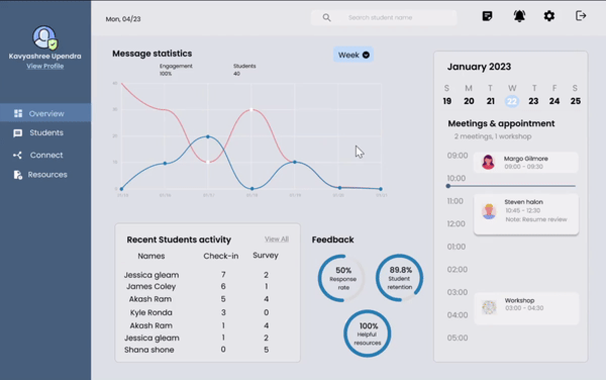
Actionable Overview: Mentors Get Up-to-Date Key metric & Student Insights
Revamped the initial overview page to show message stats(monthly & weekly), meetings scheduled to manage the mentoring sessions, and upcoming appointments with the students, and feedback. The mentors also get the most recently communicated student info to assist them better

Understanding Students: Enhanced Student Profile Insights & activity tracking
This dashboard section provides a comprehensive overview of each student: Goals, Check-in, Survey status, Last activity, and contact info. Mentors can also track engagement metrics: total students, new check-ins, and survey completions, for data-driven support

Enhanced Connect Page: with intuitive filters and detailed student
This dashboard section provides a comprehensive overview of each student: Goals, Check-in, Survey status, Last activity, and contact info. Mentors can also track engagement metrics: total students, new check-ins, and survey completions, for data-driven support

Optimized Resource Page: Categorized Support Materials & request feature
I created a Resource page with categorized materials (Health & Well-being, Career, Finances, Academic Planning) and a 'Resources Requested' column, making it easy for mentors to share relevant resources with students in just one click

The Problems Solved: Clarity, Connection, and Impact
This remodel emphasizes:
Unified Dashboard: Crucial metrics and objectives of a student's progress in one glance.
User-friendly Interface: Simplified menus for easy access to student information.
Meaningful Data: Graphics intended to spotlight areas requiring attention.
Integrated Messaging: Smooth communication within the platform.
Improved Resource Center: Grouped resources fine-tuned to usual student requirements.